From Dark to Bright to None
Light up, or not?
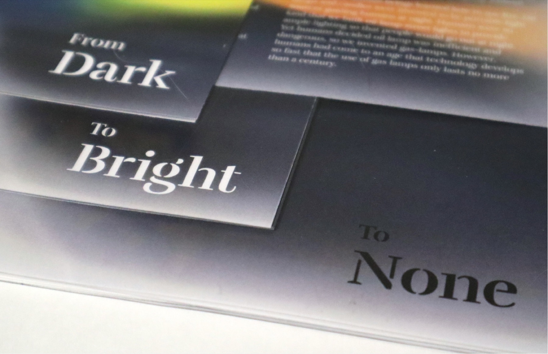
Using book design, texture experiment, and poster design to bring awareness to light pollution — emphasizing its weight through uncomfortable gradients and graphics, and how it harms the ecosystem and society.
- Role
- Designer
- Project type
- Book · Poster · Texture
- Timeline
- 2 months
- Tools
- Photoshop, Illustrator, InDesign
- Theme
- Light pollution
- Format
- Spiral-bound book
View the book below
Why the discomfort
The gradient colors are intended to be visually uncomfortable — pairing brightness against deep dark to convey the harm light pollution inflicts on animals and human beings. Rounded gradient shapes with pointy edges stand in for the threat, so the discomfort of looking mirrors the discomfort of the subject.
What I learned
Discomfort can be a design tool. By making the gradients hard to sit with, the book lets people feel the cost of light pollution before they read a single statistic — form carrying the argument as much as the words.
Thanks for reading. If anything caught your eye, I'd love to hear about it.
jon549.design@gmail.com